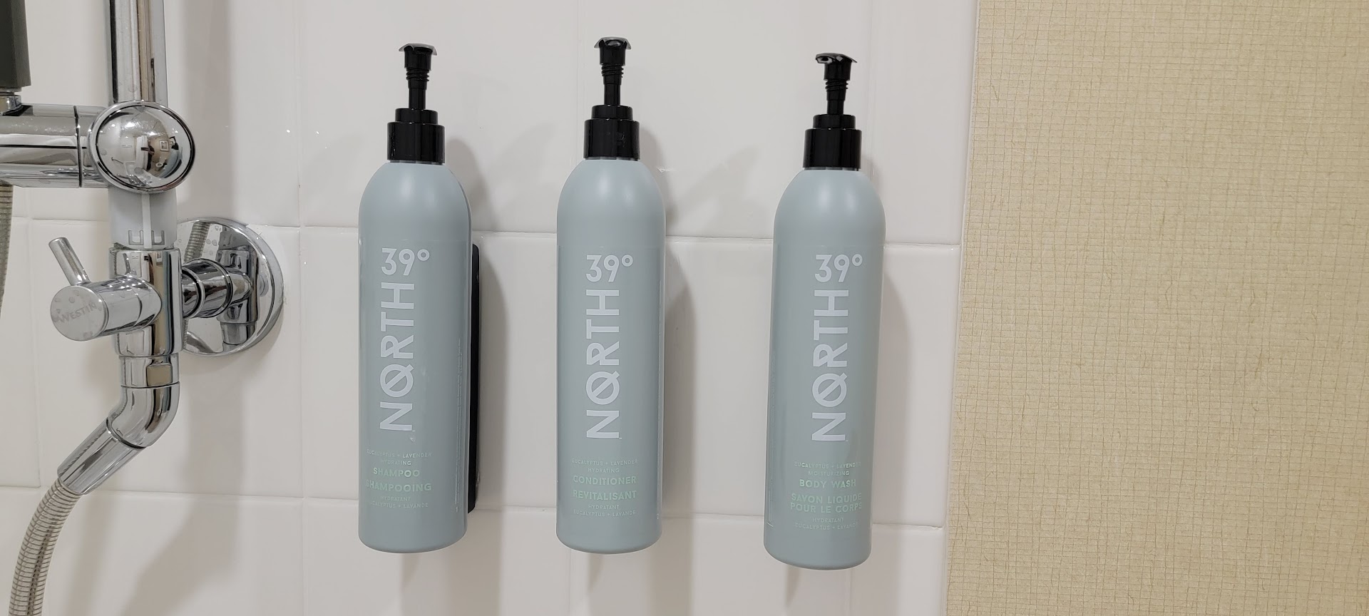
Hotel shower bottles remain one of travel's most frustrating design failures. Guests squint at minuscule labels with poor contrast, unable to distinguish shampoo from conditioner without their glasses. The problem persists across luxury and budget properties alike.
The issue stems from inconsistent labeling standards across the hospitality industry. Hotels prioritize sleek aesthetics over readability, cramming text onto bottles in fonts so small they rival medication labels. Dark text on dark bottles, or pale print on translucent containers, compounds the problem. Guests in the shower, without glasses or contacts, resort to guessing which product does what.
Major hotel chains from Marriott properties to boutique operators struggle with this oversight. Four Seasons and Ritz-Carlton suites feature the same unreadable bottles as budget chains like Motel 6. The luxury segment offers no advantage here.
This matters because guests waste products on the wrong applications. Someone applies body wash thinking it's shampoo. Conditioner gets used as soap. Travel-sized bottles run out faster. Hotels then replace them more frequently, driving up costs. Environmental waste increases too.
The solution remains simple. Hotels could enlarge fonts to at least 10-12 point size, use high-contrast color combinations, or add tactile indicators like textured labels. Some independent properties have started embossing product names directly into bottle ridges. Hilton properties have tested color-coded caps as visual shortcuts. Hyatt tested raised lettering on amenity bottles.
Industry-wide adoption has stalled despite complaints across travel forums and customer service departments. Many hotels view amenity bottles as disposable commodities rather than guest experience elements worth optimizing.
Travelers heading out can solve this themselves. Pack reading glasses in carry-ons, bring travel-sized products from home, or request larger-labeled bottles at check-in. Some properties like